Why is the PayPal website getting harder to use?
- Mark as New
- Bookmark
- Subscribe
- Mute
- Subscribe to RSS Feed
- Permalink
- Report Inappropriate Content
Am I the only one who finds the PayPal website more confusing and thus harder to use than previously? I design and build websites for perhaps twenty years now, and 'web usability' figures prominently in website design, or at least is should. That is, how 'usable' is a website, meaning that the design should empower the visitor to get things done with a minimum of confusion and mouse clicking. It used to be easy to transfer money from my PP account to my bank, but now it's tedious, for no apparent reason. I won't go into a discussion of web usability, but the PP site is not as usable as it used to be. If anyone wants suggestions on how to make it more usable for visitors, let me know. Thanks
- Labels:
-
Payments REST APIs
- Mark as New
- Bookmark
- Subscribe
- Mute
- Subscribe to RSS Feed
- Permalink
- Report Inappropriate Content
Hi @Marjamada,
We appreciate your feedback regarding the challenges you face when using the website. I see that you may be using our Business view, can you give me specific scenarios that are difficult? Is the current documentation not helpful? Is there anything we can provide that would help with the adaptation of when we make changes to our UI?
I apologize for any inconveniences this has created.
Christina
- Mark as New
- Bookmark
- Subscribe
- Mute
- Subscribe to RSS Feed
- Permalink
- Report Inappropriate Content
Thank you, Christina, for your prompt and courteous reply. OMG this is not going to be easy - web usability - but here's an example, not directly related to the website: I received a 'badge' in my email for being 'active', praise the universe! So I go back to the site to reply and then check my email inbox for your exact wording, bam, I've got another badge for 'return'. Look, it's bad enough that supermarkets have a ridiculous 'point' system or rewards or whatever, but PayPal is not a grocery store, and more junk in my inbox is NOT welcome. I get too much already to delete. Second, PayPal, to me, is like my bank's ATM - I want it to be easy to get my stuff done asap, so the user interface must be clean, to the point and fast to use. As I said, I design web sites, based on 'usability'. PayPal's website is not like Amazon or YouTube or Facebook - it's an ATM. I don't want to have to read instructions, documentation or anything else to be able to do my business. That means that links must be so clear that a visitor knows what will happen when he/she clicks on it BEFORE clicking on it. I wondered what SEND and REQUEST meant on the menu bar, so I hovered on them and saw the lower left of my screen telling me 'send money' and 'request payment'. Why not go back to those? How much room does 'money' take on that menu bar, or just use a '$'. Okay, right, send money, clear. Request what? Permission, authorization, invoice, confirmation, another badge? Why not 'Request Payment'? This could get long, so I'll cut it short by simply telling your webmaster to go back to web usability school and imagine he/she is a PayPal customer, trying to move money as quickly and painlessly as possible, and see if it's possible to re-design the site to make that possible, not a hassle. I wanted to transfer $ to my bank, and I see what? A list of selections, update or confirm my personal info, yada... What was BELOW my screen (invisible) was 'proceed anyway' or something. Why was that not visible? Why do I have to scroll the screen to view the entire list of links? Poor design and less-than-great usability. Design each page so that EVERYTHING a visitor needs is on the visible page. Again, Webmaster, imagine you are standing at an ATM on the street or outside your bank. You want to transfer your money. You want it to be easy, fast and you for sure don't want to read documentation. Now redesign the entire sight so we customers can get our business done in one minute, without any clicking on links to find out what they do, no wondering how to get your task done. I have more suggestions, but this is not supposed to be a dissertation.
- Mark as New
- Bookmark
- Subscribe
- Mute
- Subscribe to RSS Feed
- Permalink
- Report Inappropriate Content
Hi @Marjamada,
For your first pain point, Un-solicited badge's sent to your email. I can understand your point of view and luckily this one can be easily fixed. This feature is in hopes that PayPal can encourage our users to interact with each other. A sense of community where you are awarded for engaging. If you want to discontinue these notifications do the following:
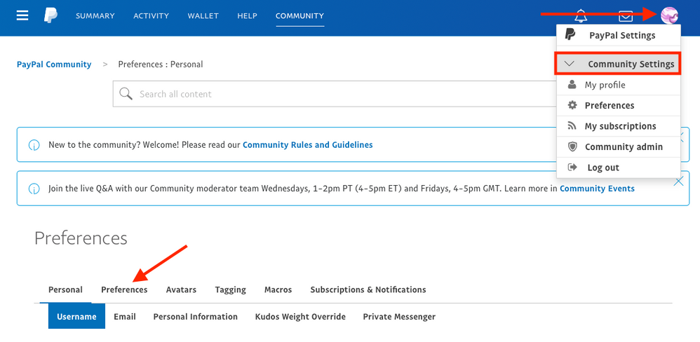
1. Select the Icon in the Right corner of the webpage > Community Settings
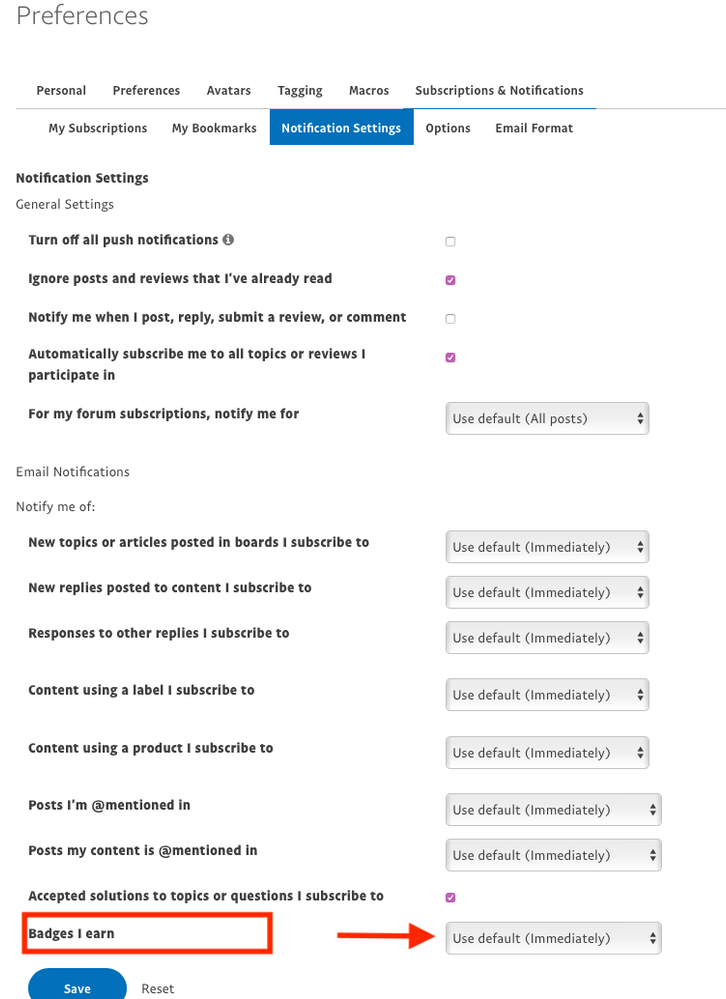
2. Next select Preferences > Notification Preferences > Badges I earn
3. Select Never and Save.
For all other pain points, I'll go back to our design teams and see how we can address each of your pain points, which are valid concerns.
If you find that there are other issues that you come across, please don't hesitate to post it here.
Thanks,
Christina
Was my post helpful? If so, please give me a kudos!
- Mark as New
- Bookmark
- Subscribe
- Mute
- Subscribe to RSS Feed
- Permalink
- Report Inappropriate Content
Thank you, Christina, for the tip on 'badges' and how not to get them. I will do that soon. Receiving less unwanted stuff in my inbox is a start, however I still feel that the PayPal webmaster could improve the site's usability. I suppose if PayPal wants to become another social media platform, your webmaster will accommodate all kinds of things, but we are seeing just how intrusive those platforms can become, when members of those communities are deplatformed, demonetized and banned for their opinions. Sooner or later, people will tire of these intrusions and manipulations and look elsewhere for alternatives. Hopefully, PayPal will not follow that model. On the topic of making PayPal's site more usable, much can be done by someone who looks at the site from the perspective of a customer who just wants to get some tasks accomplished in as little time as possible, like move money or update account information. Perhaps the majority of us don't want PayPal to become another 'community'. During my ten years having a PayPal business account, I have grown to appreciate the convenience PayPal provides by processing payments, and I would not welcome having to find another company to do this, should PayPal transform into something else. Making a site more usable is really quite simple. Again, if anyone (hint) wants to know how, let me know. This message exchange, however, is not the appropriate medium to do that.
- Mark as New
- Bookmark
- Subscribe
- Mute
- Subscribe to RSS Feed
- Permalink
- Report Inappropriate Content
The PayPal website is impossible to use. I can't even change my address on it. I don't know if they do that on purpose or they think things like "My Money" will make sense to people.
It's dreadful. Even calling them is a problem. We have to text them now.
Haven't Found your Answer?
It happens. Hit the "Login to Ask the community" button to create a question for the PayPal community.
- Button in PayPal Payments Standard
- link my PayPal business account with my WordPress website , but it's not work ?! in PayPal Payments Standard
- System error for my Paypal button after years of correct working in PayPal Payments Standard
- Mandatory Account Creation Hindering Customer Experience in REST APIs
- “This payment cannot be processed because there was an error with the capture order API call”. in REST APIs


